How to visualize water quality data in QGIS 3? From points to raster to contour lines - Tutorial
/
Spatial interpolation techniques used to evaluate estimations of physical and chemical constituents in areas where they are not estimated (Murphy et al., 2009). This tutorial will show how to interpolate data from point data to obtain a raster that covers the study area and, then, to obtain contour lines from the raster.
The Inverse Distance Weighted (IDW) method is one of the most used due to its simplicity. IDW expect that each point has a nearby impact that reduces with distance. It gives more weight to the points nearest to the forecast area. QGIS has the ability to perform this interpolation method by using data points and the result is displayed as a raster file.
Procedure
To begin with the exercise, add the point layer to the project and make sure that the attribute table contains the information of the parameter that you will interpolate.

Then, look for the IDW tool in the Processing Toolbox and double click on it to open it. You can activate the Processing toolbox by going to Processing/Processing tool box.

For this instance, the vector layer will be Data and the Interpolation attribute will be Sulfates, click on the green add symbol and then click on the three points next to Extent, finally click on Select extent on Canvas

Draw a rectangle around the points to define the study area

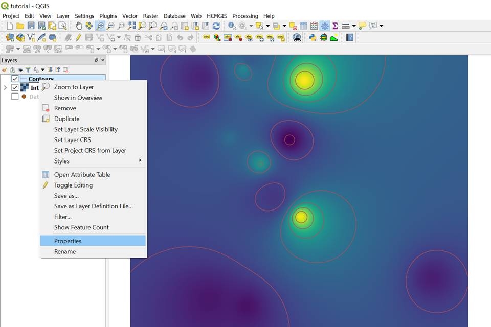
Click on Run in background and you will obtain the interpolated raster. To change the style of the raster, right click in the Interpolated raster/ Properties

Change the Render type to Singleband pseudocolor and the color ramp

Isolines or contour lines are lines of constant values on a map that can help us visualize the behavior of the data. For this example, we are looking at the concentration of sulfates of an area. Therefore, the contour lines will express the concentration values of sulfates in the study area.
To create contours from a raster file, go to the processing toolbox and look for Contour, double click on it and the Contour window will appear.

The input layer will be the Interpolated raster, the interval between contour lines will be 10. Meaning that the difference in contour lines will be of 10 units of the concentration of sulfates, finally, click on Run in Background

The contours will be created and to change to style of them and label them, right click on Properties

Click on labels, click on show labels for this layer and label with SO4, we will draw a text buffer to visualize better the labels and click on apply.

As a result we will obtain a vector layer with contour lines identifying the concentration of sulfates. As it can be seen in the image, we can detect hotspots with a concentration og 60 micrograms per liter and how the concentration diminishes as it moves away from the concentrated sulfate. This form of visualizing water quality parameters is a good tool to identify contamination plumes and potential source point pollution in water.

Tutorial
Input data
You can download the input data for this tutorial here.
References
Murphy, R. R., Curriero, F. C., & Ball, W. P. (2009). Comparison of spatial interpolation methods for water quality evaluation in the Chesapeake Bay. Journal of Environmental Engineering, 136(2), 160-171