How to create a boxplot to represent basin scale water constituents using Python - Tutorial
/Python is an interpreted high-level programming language which allows performing several statistical procedures. This programming language is an excellent option to create box plots because of its simplicity and exceptional results. This tutorial explains how to download and use Python´s Jupyter Notebook to analyze water quality data in the form of boxplots.
Box plots show the distribution of a sample using the lower quartile (Q1), the median (m or Q2) and the upper quartile (Q3)--and the interquartile range (IQR = Q3-Q1), which covers the central 50% of the data. Quartiles are values that divide the data in quarters; the term refers to the value that falls in the line that divides each quarter. Therefore, Q1 is the highest value of the first 25% of the data, Q2 is the one of the 50% of the data and Q3, the one for the 75% of the data. Characterizing the data with quartiles is advantageous because they are insensitive to outliers and preserve information about the center and spread (Krzywinski & Altman 2014).
To create a box plot, the units are located in the X or Y axis, then, the quartiles are located as well and, if the data has outliers, then the maximum and minimum values of the boxplot are determined by using the following equations:
Minimum= Q1 – (1.5*IQR)
Maximum= Q3 + (1.5*IQR)
The following graph represents the parts of a boxplot:
Boxplots are excellent tools to compare different samples. The samples can be placed one next to each other as the following graph explains:
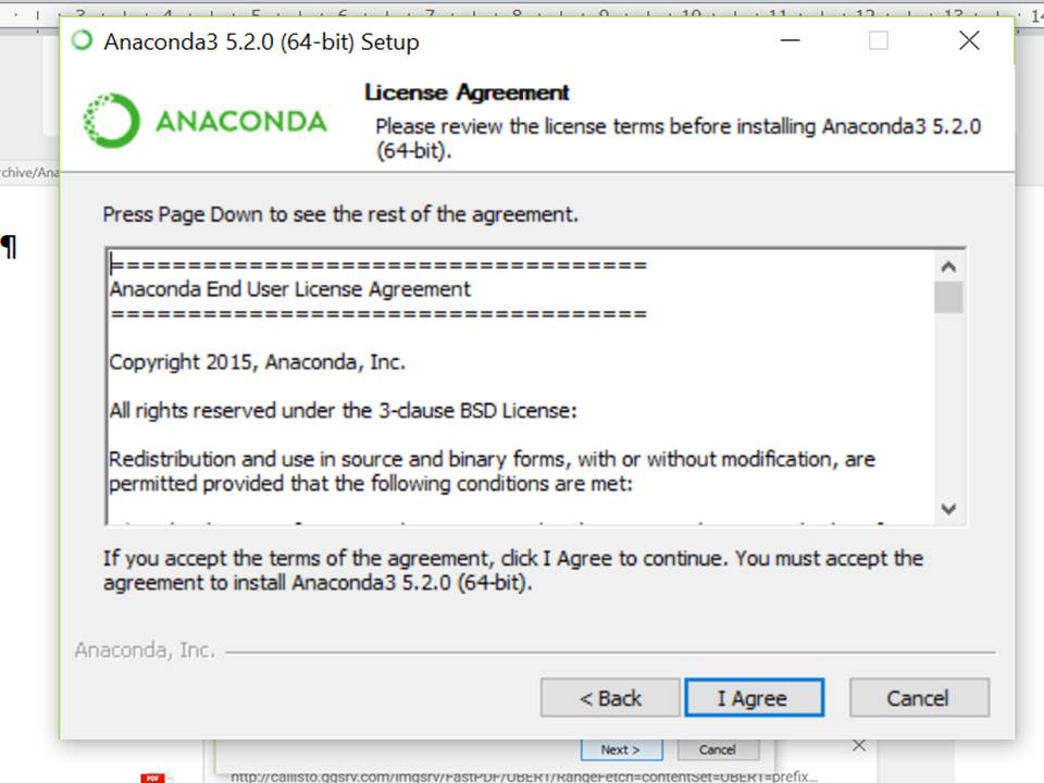
To create a boxplot, Python offers excellent tools and great results. Downloading the software is simple, go to https://www.anaconda.com/download/ and select your operating system, download the newest version.
Click on Next
Click on I Agree
Click on Next until the installation is finished
Then, look for Jupyter Notebook and run it
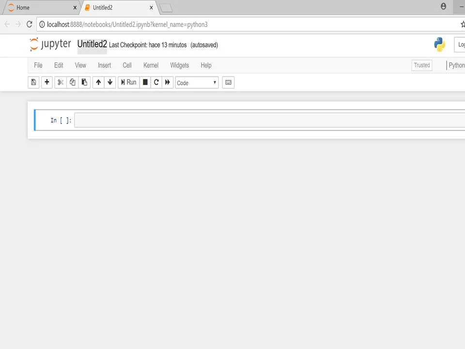
Click on New/ Python 3
Click on Untitled2
Rename the file:
Write import pandas as pd and import numpy as np, then click on Run
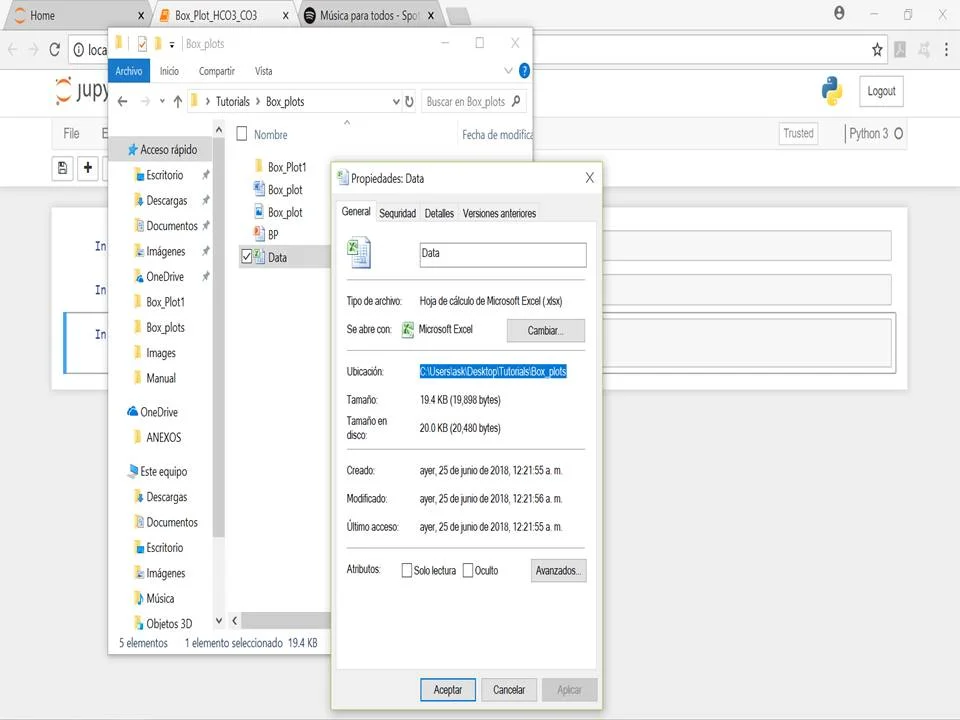
Look for the location of the file of interest. Go to the folder where your file is, right click on the file, click on Properties and copy the location:
In the Jupyter Notebook, we will use the %pylab inline magic function, which allows to include the graphs in the Notebook, next to the code and we will establish the workplace folder using %cd and the location of the data:
Then, we will read the excel file using the pd.readexcel function, first we have to write the name and the extension of the file and the name of the Sheet, and if there is an index column indicate which one it is. We will use the data.head function to indicate that the table has headings. Write the following code and click on run:
As shown in the image above, the parameters of interest are bicarbonate (HCO3-) and carbonate (CO3-2). We will create two graphs representing the parameters grouped by basin. To do so, we will use the .boxplot function and determine that the columns to be analyzed will be HCO3- and CO3-2, we will use the function “by=” to group the parameters by basin and we will change de size of the figure to 20,8 to visualize correctly the labels of the x axis. Use the following code to create the boxplot:
Finally, we will obtain two sets of boxplots, one for HCO3- and the other for CO3-2. The boxplots correspond with a basin. This dataset has 4 basins and we can compare the distribution of the sample values by analyzing the median, quartiles, minimum, maximum and outlier values from the graph. We can also compare the concentration of each ion using the values of the y axis, which represent concentration values.
In summary, Python is an excellent and easy tool to create boxplots. Boxplots are of great relevance when comparing the sample distribution value of water quality parameters. Identifying new tools to visualize statistics can help to achieve a better understanding of the data.
Tutorial
Input data
You can download the input data for this tutorial here.
References
Krzywinski, M. & Altman, N., 2014. Points of significance: visualizing samples with box plots.


